Here are the original photos that I am going to use for the front page, contents page and double page spread of my music magazine.
Front Page
Contents Page
Double Page Spread
Monday, 19 December 2011
Sunday, 18 December 2011
Music Magazine Photos
For the front cover, contents page and double page spread of my music magazine I took a total of 199 photos of two different models in different places, with different clothing, and in different poses. Even though I spent a lot of time on taking the photos, I feel that there is only a small amount of them that are good enough to be used on my magazine.
Here are all of my photos:
Friday, 16 December 2011
Magazine Target Audience
Based on the previous research I have done on UK tribes, and the target audience of other genres of music magazines, I think that I will make my magazine aimed towards people who are into the drum and bass and dubstep genre of music. Using the UK Tribes website I have worked out what sort of people my target audience consists of.
I found that the main group of people that would be interested in my type of magazine would be people who are labelled as 'Ravers'. This group of people are also known as 'Clubbers' and 'Party Crew'. Here you can see the typical media consumption of the 'Ravers'. They focus most of their time on music, magazines and the internet, and focus less on things such as TV and cinema.
As you can see, the 'Ravers' group use the internet a lot, which could suggest that they use technology frequently in their day to day lives. Based on this assumption I may include things such as a QR code that links people to a free download or link to an interactive competition on the magazines website.
There was also a list of brands and different media that people of the 'Ravers' group would be more inclined to focus on. This includes clothing brands such as Topman and Urban Outfitters, magazines such as Mixmag and FHM, radio stations such as Kiss 100 and Radio 1 and brands such as Playstation, Cream and Facebook.
I will try to base the features and colour scheme on what these different brands tend to focus on, and look at the type of language used by Mixmag and FHM to determine how I write my double page spread article. I will also use some artists featured on radio stations such as Radio 1 and refer to them in my magazine to further strengthen the link with the target audience. I also aim to do this by getting the models in the magazine to be wearing the sort of clothes you would expect someone from the 'Ravers' group to wear.
Overall I would expect the target audience of my music magazine to be males between the ages of 16-25, who regularly go to clubs and festivals, are heavy users of the internet, and are into the electro/dance/drum&bass/dubstep genres of music.
Monday, 12 December 2011
Music Magazine Photo Research
To find out what sort of clothing I wanted my models to wear for the magazine photos I did some research into what people linked with the drum and bass / dubstep genre tend to wear.
Through looking at pictures of some well known artists such as Skream, Nero, Sub Focus and Chase and Status. From looking at these pictures you can see that they all wear quite plain clothes that aren't too formal, but aren't too casual. There is a clear style for the genre of music that will feature in my magazine so I will dress my model similarly. Most dubstep and drum and bass artists, however, are usually heard more than they are seen so I wanted to add something to my picture to make it seem like my magazine is trying to uncover these artists. I tried to add this feel into the picture I was going to use for my front cover so decided that my model should wear a hat, which is also loosely linked in with this genre of music. I think that this has made my picture suited to the genre of music and makes the front cover of my magazine look more realistic.
Here you can see the original (left) and the edited (right) versions of the photo I intend to use for the front cover of my magazine.
In Photoshop I selected my model using the magnetic lasso tool so that only he was edited. I then changed the brightness and contrast so that I had the right amount of lighting in my photo and then changed the exposure and offset in order to give the person some colour. I also left the background in desaturated which make him stand out. I have also used the spot healing tool to remove any blemishes on my model's face. After all of the changes I have made to the original photo, I now think that this picture will work quite well on the cover of my music magazine.
Here are some examples of other artists that feature in the gene of music that I am basing my magazine on:
<<< Sub Focus
Through looking at pictures of some well known artists such as Skream, Nero, Sub Focus and Chase and Status. From looking at these pictures you can see that they all wear quite plain clothes that aren't too formal, but aren't too casual. There is a clear style for the genre of music that will feature in my magazine so I will dress my model similarly. Most dubstep and drum and bass artists, however, are usually heard more than they are seen so I wanted to add something to my picture to make it seem like my magazine is trying to uncover these artists. I tried to add this feel into the picture I was going to use for my front cover so decided that my model should wear a hat, which is also loosely linked in with this genre of music. I think that this has made my picture suited to the genre of music and makes the front cover of my magazine look more realistic.
Here you can see the original (left) and the edited (right) versions of the photo I intend to use for the front cover of my magazine.
In Photoshop I selected my model using the magnetic lasso tool so that only he was edited. I then changed the brightness and contrast so that I had the right amount of lighting in my photo and then changed the exposure and offset in order to give the person some colour. I also left the background in desaturated which make him stand out. I have also used the spot healing tool to remove any blemishes on my model's face. After all of the changes I have made to the original photo, I now think that this picture will work quite well on the cover of my music magazine.
Here are some examples of other artists that feature in the gene of music that I am basing my magazine on:
<<< Chase and Status
<<< Sub Focus
Skream >>>
Friday, 9 December 2011
Drum & Bass Research
Drum and Bass, often shortened to D&B or D+B, is a sub genre of electronic music that consists of fast break beats and heavy bass and sub bass lines. It originated in the late 1980s in London and Bristol as a different take to rave and jungle music. The noticeable differences to dubstep is that there are a lot faster beats, and is usually slightly more vocals in a drum and bass track.
Drum and bass hasn't been a successful in mainsream popularity, much like dubstep, but has seen the popularity increasing in recent years.
Some examples of artists currently creating drum and bass are:
Pendulum
Shy FX
Sub Focus
Danny Byrd
Drum and bass hasn't been a successful in mainsream popularity, much like dubstep, but has seen the popularity increasing in recent years.
Some examples of artists currently creating drum and bass are:
Pendulum
Thursday, 8 December 2011
Dubstep Research
Dubstep
Dubstep is a genre of electronic dance music that consists of "tightly coiled productions with overwhelming bass lines and reverberant drum patterns, clipped samples, and occasional vocals". Dubstep started out as mainly an underground scene, but gained more mainstream popularity in the late 2000s. More often than not, there will be limited vocals in a dubstep track, with most of the focus being on the music.
Some of the most popular dubstep artists making music now are:
Chase & Status
Benga
Dubstep is a genre of electronic dance music that consists of "tightly coiled productions with overwhelming bass lines and reverberant drum patterns, clipped samples, and occasional vocals". Dubstep started out as mainly an underground scene, but gained more mainstream popularity in the late 2000s. More often than not, there will be limited vocals in a dubstep track, with most of the focus being on the music.
Some of the most popular dubstep artists making music now are:
Chase & Status
Skream
Modestep
Monday, 7 November 2011
Music Magazine Name Ideas
- Venue - Chart Music
- The Mix - Chart Music
- Beat Magazine - Dance Music
- DnB Xtra - Drum and Bass
- High Frequency - Drum and Bass
- Beat-Box - Hip Hop
- Pulse - Dance Music
- Scratch - R&B
- Sampler - New Music
- Liquid - Dance Music
- Edge - R&B
- Riot - Rock
- Spotlight - Chart Music
- IND. - Indie Music
- TuneUp - Chart Music
- Loud - Rock
- Chord - Acoustic
- DubSound - Dubstep
- Audit - Chart Music
- Threshold - Rock
- FHZ (frequency hz) - Drum and bass/Dubstep
- Noise - Chart Music
- Echo - R&B/Hip Hop
- BoldBeat - Dance
- The Drop - Dubstep
- SubCulture - Drum and Bass/Dubstep
I decided that my magazine would be based around the dubstep/drum and bass genre of music. These are the names that I think are most appropriate for this type of magazine:
- SubCulture
- FHZ
- High Frequency
- DubSound
- DnB Xtra
I did a tally to find out what a group of my friends thought would be the best name for my new music magazine. The majority of people voted for the name SubCulture, which was also my favourite name for my magazine.
I then searched for different fonts that would look good with the genre of music that would be in my magazine and came up with a list of some of the best ones that I found. I decided that the fonts with a distorted look, would be more suitable for a metal magazine so will be using either 'Slant', 'Velocity', 'High Volume' or 'Cafe Nero' as the font for the title of my magazine.
Saturday, 5 November 2011
Q Magazine Analysis
According to the Bauer Media Group website the target audience of Q Magazine is 'composed of passionate, engaged and open minded music fans driven to continually discover new music - and to use this lust for discovery to influence their friends'. The target audience of the magazine is also affluent, with 75% male readers and 25% female readers.
One copy of the magazine costs £3.99. A 6 month subscription to Q Magazine costs £23.94 and a 12 month subscription costs £47.88.
The magazine is published once a month in the UK.
According to the Press Gazette website the circulation of Q Magazine is 80,418.
The monthly circulation revenue stream of Q magazine is £320,867.82. The total monthly revenue stream for advertising is £270,931. This is made up of 4 double page spreads, 17 full page adverts, 1 outside back cover, 6 half page adverts, 62 bound inserts and 3 loose inserts.
There are different costs to place an advert in Q magazine depending on the size of the advert that you want to place.
- Double Page Spread - £17,396
- Full Page - £9,156
- Page Outside Back Cover - £11,902
- Half Page - £4,578
- Bound Insert - £65
- Loose Insert - £45
The Cover
The title of the magazine is Q. The magazine was originally named Cue, as in to cue music and get it ready to play, but it was changed to Q so that it wouldn't be mistaken for a snooker magazine. One other reason why it was given the name Q was because the use of a single letter would make the magazine stand out and look more prominent on news stands.
The masthead is in plain red and white and is a very simple font. This shows that the magazine is quite sophisticated and suitable for the target audience. The fact that the masthead is partly covered by the artist Tinie Tempah shows that the magazine is established and famous enough to be recognised without the masthead being fully visible.
The strapline of the magazine, which is also partly hidden behind the image of Tinie Tempah, is "Discover Great Music". In similar fashion to the masthead, the strapline is partly hidden by the main cover image and this continues the idea that the magazine is established and know well enough for it's readers to not need to see the full strapline.
The main image on the cover of the magazine is of English Rapper Tinie Tempah. In the image he is looking directly at the camera, whilst wearing dark sunglasses and adjusting the top button of his shirt. He has a straight face in the picture and this could show that he is serious about his music. He is wearing clothes that would fit in with his genre of music, and what the target audience of the magazine would also be wearing. This could be one factor that makes the public buy the magazine, because they can relate it to themselves.
The typeface on the front cover of the magazine looks handwritten which makes it look like it is very different to other magazines, and grabs your attention. There is also bold, dark text to highlight what the main feature in the magazine is about. There isn't that much text on the cover of the magazine; there is the name of the artist who features on the cover, the cover lines at the top and bottom of the page and the list of artists that are featured in other special editions of the magazine. The text on the cover is all in plain black. The signature of Tinie Tempah on the front is white, which makes it stand out from the rest of the text, making him seem important. The text in the footer is also gold which shows that this is a feature worth looking at. The text on the cover of the magazine is also very formal. There isn't any use of colloquial language which makes the magazine appear to be serious about the music they are reporting about.
This issue of the magazine is quite different to other music magazines as there is one big picture with very little text on the cover. If you compare it to Vibe magazine you will see that there is a lot of text on there, and not very much on Q. There is also a gold and black coloured border around the edge of the magazine which isn't on any other music magazines that I have seen. The distinctive feature on the cover of the magazine is the signature of Tinie Tempah. You wouldn't normally see an artist's signature on the cover of a music magazine. You could say that this, along with the fact that the magazine is the 25th anniversary collectors edition, is the unique selling point of the magazine. This is similar to the rest of the covers that make up the 25th Edition Collectors Edition, and you can see that there is a double page spread at the beginning of the magazine showing each of these.
Inside
There are 170 pages inside the magazine.
There are 36 pages of adverts inside the magazine.
The types of products that are advertised in the magazine are:
The features/article topics in the magazine are:
The content that is promoted by the cover lines is the fact that this months magazine is a "25th anniversary collector's edition". The cover line at the bottom of the front page also promotes the "145 albums to discover".
The typeface on the front cover of the magazine looks handwritten which makes it look like it is very different to other magazines, and grabs your attention. There is also bold, dark text to highlight what the main feature in the magazine is about. There isn't that much text on the cover of the magazine; there is the name of the artist who features on the cover, the cover lines at the top and bottom of the page and the list of artists that are featured in other special editions of the magazine. The text on the cover is all in plain black. The signature of Tinie Tempah on the front is white, which makes it stand out from the rest of the text, making him seem important. The text in the footer is also gold which shows that this is a feature worth looking at. The text on the cover of the magazine is also very formal. There isn't any use of colloquial language which makes the magazine appear to be serious about the music they are reporting about.
This issue of the magazine is quite different to other music magazines as there is one big picture with very little text on the cover. If you compare it to Vibe magazine you will see that there is a lot of text on there, and not very much on Q. There is also a gold and black coloured border around the edge of the magazine which isn't on any other music magazines that I have seen. The distinctive feature on the cover of the magazine is the signature of Tinie Tempah. You wouldn't normally see an artist's signature on the cover of a music magazine. You could say that this, along with the fact that the magazine is the 25th anniversary collectors edition, is the unique selling point of the magazine. This is similar to the rest of the covers that make up the 25th Edition Collectors Edition, and you can see that there is a double page spread at the beginning of the magazine showing each of these.
Inside
There are 170 pages inside the magazine.
There are 36 pages of adverts inside the magazine.
The types of products that are advertised in the magazine are:
The features/article topics in the magazine are:
- Features - Interviews / Main Stories
- QMail - Letters from readers
- Q50 - The month's essential songs
- Now - Interview with artists on the road
- Subscribe - Subscription offer
- Q Quiz
- Last Requests - The last great record YOU heard
- The Q Review - Review of new albums / live events
There are 36 double page spreads in the magazine. These mainly consist of the interviews with 25 different artists, such as Muse, Arcade Fire, Elbow, Noel Gallagher and Coldplay, which is the main feature of the magazine. The other things that make up the double page spreads are album reviews, live concert reviews, and overview of the Q awards.
The only advertorial that appears in the magazine is called 'Walls of Sound'. The article is written by Q and is listed as a 'Q Promotion'. It is promoting Monitor Audio's new sound frame system. It fits in with the magazine as it is to do with music and is something that readers of Q magazine might be interested in buying.
The magazine achieves a unified house style by keeping a very plain colour scheme. The backgrounds of nearly all of the articles are either black or white. The Q logo also features regularly through the magazine, usually being at the top of the articles and other features. The mode of the address and language stay very formal throughout the magazine which helps keep a unified house style.
This house style is appropriate to the target audience as they are described as being 'affluent'. This is the sort of language and colour schemes they would expect in a magazine, and not one full of colloquial language and different colours.
Wednesday, 2 November 2011
NME Magazine Analysis
General
NME magazine is produced and published by IPC Media, which is owned by Time Inc.
According to NME.com the target audience of the magazine is men who are aged between 17-30. The average age of readers is expected to be around 25. According to the publishers website, the target audience of the magazine would be people who are entertainment enthusiasts, are techno savvy, love going to festivals and concerts and generally love the atmosphere of live events.
The magazine is published weekly, and each issue costs £2.40. The circulation of the magazine is 56,284 and the readership is 411,000.
The monthly circulation revenue stream of NME magazine is approximately £540,326.40. The total monthly advertising revenue stream is £67,071. To place an advert in the magazine there are different costs depending on the size of the advert you want to place.
- Full page advert - £4635
- Half page advert - £2575
- Quarter page advert - £1416
- Eighth page advert - £772
- Sixteenth page advert - £418
The overall monthly revenue stream combining both advertising and circulation is £607,397.40
The Cover
The title of the magazine is NME. This stands for New Musical Express. The abbreviation of the title has become more like a brand, as it is better known than the full title. The abbreviated version of the name is also easier to remember, making it a better choice for putting on the cover of the magazine.
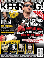
The masthead/title logo is very large and in plain white. These features give give the magazine a very simple and relaxed feel and make it not so in your face unlike other magazines such as Kerrang for example. >>>
The plain white colour of the title against the background also helps it to stand out and distinguishes it from the other text on the page. The positioning of the title in the top left corner is also good because it acts as a main reference point. It can easily be seen and is one of the first things a reader will see when they pick up the magazine, mainly because of the way it stands out from the other text.
There is no strapline on the cover of the magazine. I don't think that one is really needed as the title itself is easily remembered and is quite catchy. If there was a strapline on the magazine it could start to look quite complicated and over the top. The strapline is usually a memorable phrase, and with the already memorable title, readers could start to feel like the magazine is trying too hard to get readers to remember it.
The main image on the magazine cover is of Florence Welch, who is the lead singer of the band 'Florence and the Machine'. The image looks very simple and plain, and there aren't any bright colours in what she is wearing. This gives you the impression that it is a very relaxed magazine and that it will be very easy to read and get into. This reaches out to the ideal reader as it is very relaxed and makes the magazine look interesting and easy to read. The facial expression of Florence makes it look like she is trying to bring emotion to the magazine. This could be a way of showing that everything written in the magazine is true and not made up or false in any way. This could make the magazine more attractive to its audience. In the picture Florence is looking directly at the camera. This gives the effect that she is looking directly at the reader and can draw you in to reading the magazine.
The only other image that appears on the cover of the magazine is a small picture of a member of the band 'Joy Division'. It is placed there to advertise the fact that there is a feature on him in the magazine.
The content that is promoted by the cover lines is to advertise the main stories and features in the magazine. They tell you that there are album reviews, who the main stories are about, and what is being given away with the magazine
The font on the font cover of the magazine is very simple. It isn't very hard to read and is laid out so that you can tell the difference between each heading. The text is also plain black and white. This isn't very appealing and makes the magazine look quite dull. This is changed when you see that there is large text in bright red to highlight that the article with Florence Welch is the main story.
The text on the cover isn't particularly formal. This is because the magazine wants to be able to connect with the readers. The use of 'And, er, quite a lot more...' is easy for the reader to relate to because they would read it and feel like someone is actually talking to them, and that they aren't just reading a bit of text.
The cover does look similar to other magazines, but only in the way that the title is laid out in the same place. The picture in the middle of the page is also similar to other magazines. The only real difference you can see is if you compare it to Q magazine for example, and you will see that there is a lot more text on NME. The unique selling point of the magazine is that they are offering a 'world exclusive comeback interview' with Florence Welch.
Inside
- There are 66 pages in the magazine
- There are 17 pages of adverts in the magazine
- Clothing
- Alcohol
- Music
- Mobile Phones
- TV Shows
- Books
- Radio
- Toiletries (aftershave)
The features/article topics in the magazine are:
- On Repeat - Popular songs of the week
- Upfront - Musical news of the week
- Versus - Interview with Annie Mac and 'The NME Chart'
- Radar - 'Future stars, Breaking scenes, New sounds
- Features - Interviews
- Reviews
- Live - Gig news
- On the road - Interview with a touring band
- Booking now
- Gig guide
- Fan mail
- Braincells - Quiz with band members
- Radar - New bands and new music shows
- Introduction to the interview with Florence Welch
- Interview with Florence Welch
- Interview with Wu Lyf
- Interview with Orlando Higginbotham from Totally Enormous Extinct Dinosaurs
- NME's best song from the past 15 years
- Poster of Ian Curtis from Joy Division
- Information about a gig by the band Foals
- On the road interview with Slow Club
- Gig guide - 2 double page spreads
- Fan mail
There is one advertorial in the magazine, and is for a Sony Ericsson phone. It looks like it is an article mixed with an advert because it is not just about the product. It links with music and how the phone can be used to capture your gig memories in flawless quality.
The magazine achieves a uniformed house style by having all of the titles in bold, capital letters. There is also the same fonts used throughout the magazine. Articles also have colour themes to them. The sub headings and pictures of some articles are based around the colours red, yellow and blue. There is also the use of some colloquial language in the magazine. These all help the magazine to relate to its target audience; it isn't too formal and is very easy to look at and read, which is what the 17-30 age group would be looking for in a magazine.
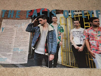
Here you can see the different colours that some >>>
of the articles are based around.
Here you can see the different colours that some >>>
of the articles are based around.
Subscribe to:
Posts (Atom)