Here you can see each separate step that I have taken to complete the front cover of my magazine:
 Here is the original photo that I intended to use for the front cover of my magazine.
As you can see, the picture is in a sepia colour tone, which i don't think will be appropriate for the genre of music magazine that I am creating.
As you can see here, I have cut out my model from the background of the original picture using the quick select tool. I then used the 'feather selection' tool with a radius of 2 pixels so that the cut out of the image would look smooth. I made a new layer with a white fill to use as the background of the front cover.
Here is the original photo that I intended to use for the front cover of my magazine.
As you can see, the picture is in a sepia colour tone, which i don't think will be appropriate for the genre of music magazine that I am creating.
As you can see here, I have cut out my model from the background of the original picture using the quick select tool. I then used the 'feather selection' tool with a radius of 2 pixels so that the cut out of the image would look smooth. I made a new layer with a white fill to use as the background of the front cover.
 I then used the 'spot healing brush' to remove the blemishes on my model's face, and put the picture into black and white.
You can see here that I have added the title of my music magazine to the front cover. I used the font, 'Slant' and chose the colour of the title to be red. I decided to add the 'Stroke' effect onto the text in order to make it stand out and be bold. The layer that the title is on was then moved below the picture so that it would appear behind the image on the front page.
The next step that I took was to add the at the top of the page. I placed the text here as without it, there is a lot of space above the title and the page looks quite empty. I used the same colour text as the title and used a larger 'stroke' on the price so that i could get an effective fill behind it without it being a simple rectangle. I think this gives off quite a good effect, which I think matches with the music genre my magazine is covering.
I then used the 'spot healing brush' to remove the blemishes on my model's face, and put the picture into black and white.
You can see here that I have added the title of my music magazine to the front cover. I used the font, 'Slant' and chose the colour of the title to be red. I decided to add the 'Stroke' effect onto the text in order to make it stand out and be bold. The layer that the title is on was then moved below the picture so that it would appear behind the image on the front page.
The next step that I took was to add the at the top of the page. I placed the text here as without it, there is a lot of space above the title and the page looks quite empty. I used the same colour text as the title and used a larger 'stroke' on the price so that i could get an effective fill behind it without it being a simple rectangle. I think this gives off quite a good effect, which I think matches with the music genre my magazine is covering.

 After finishing the top part of my magazine, I decided that the next part to focus on was the bottom. I thought that the cover would look a bit empty with just different coloured text around the page, so I decided to put in a banner. I created it by using the 'rectangle tool' to draw a rectangle at the bottom of the page. It looked quite boring just being a red rectangle so I added an emboss and a slight stroke around the edge. This gave off the blurred effect around the edge. I then added the name of some artists to the banner, using different fonts to give some variety.

The next step towards completing my front cover was to add the main cover line and text that relates to the main image. I first created the background area for the 'EXCLUSIVE' header by creating a rectangle using the 'rectangle tool' and gave it a yellow fill.The yellow helps the black text stand out and highlights the fact that it is a main feature. I then added the text and made the main word red in order to grab the readers attention.
After that, I decided to add some more text to the page. Keeping with the original design of my front cover I increased the size of 'A-Z' and made it in red, so that it would grab the readers attention.
At this point I decided to move away from the original idea I had for my front cover. Instead of just having a barcode at the bottom left corner of my page, I decided to create a box where I could have the barcode, and add some more text. I started out by using the 'rectangle tool' to create a rectangle which I filled in black. I then gave it a yellow 'stroke' to keep with the colour scheme and style of the rest of the front cover.
Instead of just grabbing any old barcode off the internet I found it to be easier to download a barcode font and use that as it allows me to create a barcode to the exact size that I wanted, and doesn't bring about the hassle of re-sizing a picture, losing clarity.
After I had finished the barcode and put it into the correct place, I added a yellow rectangle in which I put black text, and put yellow text in the left over black background. I think that the contrasting colours work well here and keep to the colour scheme of the magazine.
As you could see from the last step, the bottom of the magazine was looking very empty due to the lack of text, so I decided to put some information about a competition, as you wouldn't normally get main stories running along the bottom of the magazine. I made the text red to match the colour scheme and to make it stand out from my model's top.
In the same way that I did for the 'EXCLUSIVE' coverline, I made another one. This makes the overall design of the front cover similar, and can be used later on in my magazine to produce a main house style. Again i made the main part of the coverline in red to make it stand out, but also made it larger for a greater impact.
This is the final result!
Here you can see the finished first draft of my magazine front cover. I have added a list of artists to the left hand side of the page, and put them in red font to match the colour scheme. I did, however, change the font for this part as the front cover looked quite boring with every bit of text being the same.
I looked at the peer assessment my magazine was given halfway through the developement and have changed many features such as the text at the bottom and filling in all the space, but have decided to go against changing the picture. This is because I thhink it matches in with the colour scheme (grey text, white background) and gives off quite an urban, edgy look to the magazine that is often related to the genre of music the magazine is covering.
So there it is, finished! Overall I am very happy with the finished first draft of my magazine, and look forward to making my contents page and double page spread to go with it!


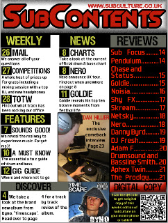
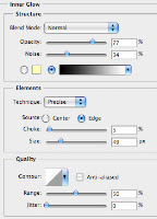 The first step taken was the creation of the basic layout of my contents page. I created the box for the title running across the top of the page and added in an inner glow to give the black effect around the border of the box. I then used the rectangle tool to create the rest of the heading boxes for other sections of the contents page. I gave them a black fill and the bottom box a grey fill as it was to contain totally different information to the other sections.

 I then added the main picture into my contents page. I aligned it and resized it so that it fitted in with the right hand column of the page. I added a black stroke around the picture to make it stand out slightly more from the white background. I then added in the text over the top of the picture.
 The next step I took to completing my contents page was to add in the album cover that I had previously created using photoshop. I cropped the image of my model into a square to represent the shape of real album covers. I then added a blue background into it with a white outer glow to the model. The final thing I did was to add in a clock in the corner of the screen and made it transparent and then added in text and an explicit content label. The cover was then resized to fit at the bottom of the page.