General
NME magazine is produced and published by IPC Media, which is owned by Time Inc.
According to NME.com the target audience of the magazine is men who are aged between 17-30. The average age of readers is expected to be around 25. According to the publishers website, the target audience of the magazine would be people who are entertainment enthusiasts, are techno savvy, love going to festivals and concerts and generally love the atmosphere of live events.
The magazine is published weekly, and each issue costs £2.40. The circulation of the magazine is 56,284 and the readership is 411,000.
The monthly circulation revenue stream of NME magazine is approximately £540,326.40. The total monthly advertising revenue stream is £67,071. To place an advert in the magazine there are different costs depending on the size of the advert you want to place.
- Full page advert - £4635
- Half page advert - £2575
- Quarter page advert - £1416
- Eighth page advert - £772
- Sixteenth page advert - £418
The overall monthly revenue stream combining both advertising and circulation is £607,397.40
The Cover
The title of the magazine is NME. This stands for New Musical Express. The abbreviation of the title has become more like a brand, as it is better known than the full title. The abbreviated version of the name is also easier to remember, making it a better choice for putting on the cover of the magazine.
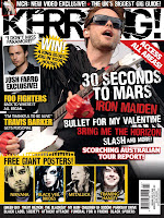
 The masthead/title logo is very large and in plain white. These features give give the magazine a very simple and relaxed feel and make it not so in your face unlike other magazines such as Kerrang for example. >>>
The plain white colour of the title against the background also helps it to stand out and distinguishes it from the other text on the page. The positioning of the title in the top left corner is also good because it acts as a main reference point. It can easily be seen and is one of the first things a reader will see when they pick up the magazine, mainly because of the way it stands out from the other text.
The masthead/title logo is very large and in plain white. These features give give the magazine a very simple and relaxed feel and make it not so in your face unlike other magazines such as Kerrang for example. >>>
The plain white colour of the title against the background also helps it to stand out and distinguishes it from the other text on the page. The positioning of the title in the top left corner is also good because it acts as a main reference point. It can easily be seen and is one of the first things a reader will see when they pick up the magazine, mainly because of the way it stands out from the other text.
There is no strapline on the cover of the magazine. I don't think that one is really needed as the title itself is easily remembered and is quite catchy. If there was a strapline on the magazine it could start to look quite complicated and over the top. The strapline is usually a memorable phrase, and with the already memorable title, readers could start to feel like the magazine is trying too hard to get readers to remember it.
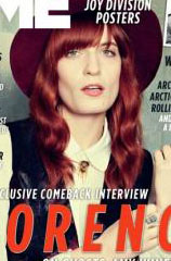
The main image on the magazine cover is of Florence Welch, who is the lead singer of the band 'Florence and the Machine'. The image looks very simple and plain, and there aren't any bright colours in what she is wearing. This gives you the impression that it is a very relaxed magazine and that it will be very easy to read and get into. This reaches out to the ideal reader as it is very relaxed and makes the magazine look interesting and easy to read. The facial expression of Florence makes it look like she is trying to bring emotion to the magazine. This could be a way of showing that everything written in the magazine is true and not made up or false in any way. This could make the magazine more attractive to its audience. In the picture Florence is looking directly at the camera. This gives the effect that she is looking directly at the reader and can draw you in to reading the magazine.
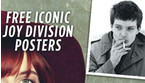
The only other image that appears on the cover of the magazine is a small picture of a member of the band 'Joy Division'. It is placed there to advertise the fact that there is a feature on him in the magazine.
 The content that is promoted by the cover lines is to advertise the main stories and features in the magazine. They tell you that there are album reviews, who the main stories are about, and what is being given away with the magazine
The font on the font cover of the magazine is very simple. It isn't very hard to read and is laid out so that you can tell the difference between each heading. The text is also plain black and white. This isn't very appealing and makes the magazine look quite dull. This is changed when you see that there is large text in bright red to highlight that the article with Florence Welch is the main story.
 The text on the cover isn't particularly formal. This is because the magazine wants to be able to connect with the readers. The use of 'And, er, quite a lot more...' is easy for the reader to relate to because they would read it and feel like someone is actually talking to them, and that they aren't just reading a bit of text.
 The cover does look similar to other magazines, but only in the way that the title is laid out in the same place. The picture in the middle of the page is also similar to other magazines. The only real difference you can see is if you compare it to Q magazine for example, and you will see that there is a lot more text on NME. The unique selling point of the magazine is that they are offering a 'world exclusive comeback interview' with Florence Welch.
Inside
- There are 66 pages in the magazine
- There are 17 pages of adverts in the magazine
The products being advertised are:
- Clothing
- Alcohol
- Music
- Mobile Phones
- TV Shows
- Books
- Radio
- Toiletries (aftershave)
The features/article topics in the magazine are:

- On Repeat - Popular songs of the week
- Upfront - Musical news of the week
- Versus - Interview with Annie Mac and 'The NME Chart'
- Radar - 'Future stars, Breaking scenes, New sounds
- Features - Interviews
- Reviews
- Live - Gig news
- On the road - Interview with a touring band
- Booking now
- Gig guide
- Fan mail
- Braincells - Quiz with band members
There are 12 double page spreads in the magazine. These are:
- Radar - New bands and new music shows
- Introduction to the interview with Florence Welch
- Interview with Florence Welch
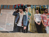
- Interview with Wu Lyf
- Interview with Orlando Higginbotham from Totally Enormous Extinct Dinosaurs
- NME's best song from the past 15 years
- Poster of Ian Curtis from Joy Division
- Information about a gig by the band Foals
- On the road interview with Slow Club
- Gig guide - 2 double page spreads
- Fan mail
There is one advertorial in the magazine, and is for a Sony Ericsson phone. It looks like it is an article mixed with an advert because it is not just about the product. It links with music and how the phone can be used to capture your gig memories in flawless quality.
 The magazine achieves a uniformed house style by having all of the titles in bold, capital letters. There is also the same fonts used throughout the magazine. Articles also have colour themes to them. The sub headings and pictures of some articles are based around the colours red, yellow and blue. There is also the use of some colloquial language in the magazine. These all help the magazine to relate to its target audience; it isn't too formal and is very easy to look at and read, which is what the 17-30 age group would be looking for in a magazine.
Here you can see the different colours that some >>>
of the articles are based around.

 I did a tally to find out what a group of my friends thought would be the best name for my new music magazine. The majority of people voted for the name SubCulture, which was also my favourite name for my magazine.


