Friday 27 January 2012

Contents Page


Draft 1                                               Final Draft

Wednesday 25 January 2012

Contents Page Construction

Here you can see each separate step that I have taken to complete the contents page of my music magazine.


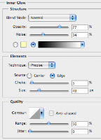
The first step taken was the creation of the basic layout of my contents page. I created the box for the title running across the top of the page and added in an inner glow to give the black effect around the border of the box. I then used the rectangle tool to create the rest of the heading boxes for other sections of the contents page. I gave them a black fill and the bottom box a grey fill as it was to contain totally different information to the other sections.


I added the titles to each header and then added the title of the magazine contents but changed it slightly. Instead of putting in the title of the magazine a again, I slightly changed it to 'SubContents'. This had a red fill and a black stroke around it to help it stand out from the white background behind it.


All of the text relating to each of the sections was added in next. I made the titles of each section larger than the text underneath them. This helps it stand out and gives the reader a clear idea of what the section is about before.
One other feature I added at this point was the website address above the title to keep it from looking too plain and empty.


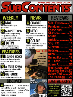
I then added the main picture into my contents page. I aligned it and resized it so that it fitted in with the right hand column of the page. I added a black stroke around the picture to make it stand out slightly more from the white background. I then added in the text over the top of the picture.


The next step I took to completing my contents page was to add in the album cover that I had previously created using photoshop. I cropped the image of my model into a square to represent the shape of real album covers. I then added a blue background into it with a white outer glow to the model. The final thing I did was to add in a clock in the corner of the screen and made it transparent and then added in text and an explicit content label. The cover was then resized to fit at the bottom of the page.


Instead of just typing out the page numbers next to the text, I created a small black box using the rectangle tool. I then duplicated the layer with the first black box into 9 more layers. I then moved each of them to the left of the text and added the page numbers to each of them and merged the text and box layers together. This is so that I could move the whole thing around without having to readjust the position of the text within the box.
The final step taken to complete my contents page was to fill in the space in the bottom right corner of the page. As I wanted it to attract to my target audience as much as possible I included a QR code. This relates to my target audience as they are heavily influenced by technology. I placed it into the very bottom right and then aded text to the left of it. The final thing I did was to add one final banner above the text and qr code. I made it red to show that it is a different section to the other parts of the contents page. I added a inner shadow to the top of the banner to make the colour seem like it has faded in. I then added the text into the banner to finish my contents page.


<< Here is the final piece of work.

Tuesday 24 January 2012

Contents Page Flat Plan

This is the original design I came up with for the contents page of my music magazine.


Contents Page Research

There are many different types of contents pages for music magazine, usually based around the genre of music that the magazine is covering. Some contents pages have lots of pictures, but some have very few pictures. An example of a magazine that has a lot of pictures on the front page is Kerrang. Kerrang is a rock magazine and it's contents page contains a lot of pictures, which makes it stand out and in your face, much like the music genre. NME and Q magazine are indie/alternative and popular music magazines respectively. They use less pictures and put more text in the contents page, making it feel more subdued and relaxed which is what the music genre tends to be like.

Based on this I think that I will add less pictures (around 2) and have more text. Some magazines have images of an album cover or album artist and have a section set aside to talk about the album. I think I will put this in my magazine as it is a very good idea, and will be a good addition to my contents page asides from just stories.


On these magazines (Kerrang, bottom, NME, bottom right and Q, right) you can see that the contents pages are split into a number of columns, usually two or three, to contain the text. I think that by using three columns I will be able to fit more stories into the contents page. If I only have two columns in my contents page the text would have to be very large to fill in all the white space, and could end up looking quite unprofessional. For this reason I will probably put three columns into my contents page.


Contents Page Design
Here is my initial design for my contents page. Overall I am fairly happy with the design but I think that if I keep exactly to the design it may end up looking quite empty. This is because I have only put in two columns of text that is quite large compared to the text on my front page design. I may re-design my contents page and split the page into three columns.

I like the positioning of where I am going to put the two photos as they will grab the readers attention, but won't dominate the whole of the page. The overall design of the contents page means that I can fit a lot of information and stories in it. I researched into the average number of pages in a weekly music magazine and found that on average there are between 60-70 pages. I will now be able to make the page numbers of the articles in the contents page seem more realistic. The border around each section of the contents page is also good as it makes each part stand out and clearly separates them from other sections.

Here is the original, unedited picture that I intend to use for the main story in my contents page. It is quite similar to the image on my front page, but the model is wearing different clothing and is in a different position. I will put the photo exactly where I did in the flat plan of my contents page as I think this is easily relatable to the image on the front page.


Here you can see the original, unedited picture that I intend to use for an album cover on the bottom of my contents page in the review section. I want to be able to make this picture look like it is from a real album cover so I will crop it down to 340 x 340 and then add in some effects on photoshop, as you never see album covers as just a plain image.


Here are some album covers that I think will work well on my contents page, so I will try to take some elements from all of them to create my own album cover.


Thursday 19 January 2012

Front Page Construction

Here you can see each separate step that I have taken to complete the front cover of my magazine:


Here is the original photo that I intended to use for the front cover of my magazine.
As you can see, the picture is in a sepia colour tone, which i don't think will be appropriate for the genre of music magazine that I am creating.


As you can see here, I have cut out my model from the background of the original picture using the quick select tool. I then used the 'feather selection' tool with a radius of 2 pixels so that the cut out of the image would look smooth. I made a new layer with a white fill to use as the background of the front cover.
I then used the 'spot healing brush' to remove the blemishes on my model's face, and put the picture into black and white.
You can see here that I have added the title of my music magazine to the front cover. I used the font, 'Slant' and chose the colour of the title to be red. I decided to add the 'Stroke' effect onto the text in order to make it stand out and be bold. The layer that the title is on was then moved below the picture so that it would appear behind the image on the front page.
The next step that I took was to add the at the top of the page. I placed the text here as without it, there is a lot of space above the title and the page looks quite empty. I used the same colour text as the title and used a larger 'stroke' on the price so that i could get an effective fill behind it without it being a simple rectangle. I think this gives off quite a good effect, which I think matches with the music genre my magazine is covering.
After finishing the top part of my magazine, I decided that the next part to focus on was the bottom. I thought that the cover would look a bit empty with just different coloured text around the page, so I decided to put in a banner. I created it by using the 'rectangle tool' to draw a rectangle at the bottom of the page. It looked quite boring just being a red rectangle so I added an emboss and a slight stroke around the edge. This gave off the blurred effect around the edge. I then added the name of some artists to the banner, using different fonts to give some variety.
The next step towards completing my front cover was to add the main cover line and text that relates to the main image. I first created the background area for the 'EXCLUSIVE' header by creating a rectangle using the 'rectangle tool' and gave it a yellow fill.The yellow helps the black text stand out and highlights the fact that it is a main feature. I then added the text and made the main word red in order to grab the readers attention.
After that, I decided to add some more text to the page. Keeping with the original design of my front cover I increased the size of 'A-Z' and made it in red, so that it would grab the readers attention.
At this point I decided to move away from the original idea I had for my front cover. Instead of just having a barcode at the bottom left corner of my page, I decided to create a box where I could have the barcode, and add some more text. I started out by using the 'rectangle tool' to create a rectangle which I filled in black. I then gave it a yellow 'stroke' to keep with the colour scheme and style of the rest of the front cover.
Instead of just grabbing any old barcode off the internet I found it to be easier to download a barcode font and use that as it allows me to create a barcode to the exact size that I wanted, and doesn't bring about the hassle of re-sizing a picture, losing clarity.
After I had finished the barcode and put it into the correct place, I added a yellow rectangle in which I put black text, and put yellow text in the left over black background. I think that the contrasting colours work well here and keep to the colour scheme of the magazine.
As you could see from the last step, the bottom of the magazine was looking very empty due to the lack of text, so I decided to put some information about a competition, as you wouldn't normally get main stories running along the bottom of the magazine. I made the text red to match the colour scheme and to make it stand out from my model's top.
In the same way that I did for the 'EXCLUSIVE' coverline, I made another one. This makes the overall design of the front cover similar, and can be used later on in my magazine to produce a main house style. Again i made the main part of the coverline in red to make it stand out, but also made it larger for a greater impact.


This is the final result!
Here you can see the finished first draft of my magazine front cover. I have added a list of artists to the left hand side of the page, and put them in red font to match the colour scheme. I did, however, change the font for this part as the front cover looked quite boring with every bit of text being the same.


I looked at the peer assessment my magazine was given halfway through the developement and have changed many features such as the text at the bottom and filling in all the space, but have decided to go against changing the picture. This is because I thhink it matches in with the colour scheme (grey text, white background) and gives off quite an urban, edgy look to the magazine that is often related to the genre of music the magazine is covering.


So there it is, finished! Overall I am very happy with the finished first draft of my magazine, and look forward to making my contents page and double page spread to go with it!

Tuesday 17 January 2012

My Work So Far - Peer Analysis


In today's lesson we did a peer analysis of each others work so far in order to get a better understanding of what features are good, and what features are not so good in our magazines so far. This helped us to get an idea of what we need to improve to make our magazines look to more of a professional quality.

The points that people though were good about my work were: 
  • Title font and design.
  • Layout of front page
  • Housestyle is good and everything is colour co-ordinated.
  • Text font and choice of positioning is good.
  • Continuity from front page to contents.
  • Layout.
  • Very good title and side stories.
The points that people thought weren't so good about my magazine and needed improving were:
  • There is too much white space at the moment.
  • The text on my model's shirt should be a different colour.
  • Model in the photo could be doing more to fit into the genre of music.
  • A few more straplines could be put in.
  • The picture doesn't look as good in black and white.
  • Picture needs to be repositionesd slightly.
Based on all of these comments I will be making some changes. I think that the main change I will make will be to my picture. I will try to adjust the colour of the photo and re-align it so that it fits in with the front cover more. If I cannot get it to look how I want it to, I may also take another photo with a better idea of how it needs to look.

I will also adjust the text on the bottom of the magazine so that you can see it clearer instead of it blending in with my model's top, and add some more cover lines to fill in the rest of the white space. I will also finish my contents page considering points made about my front cover so that I can keep a good house style etc.

Saturday 7 January 2012

Front Cover Planning

Here is the initial design that I came up with for the front page.


Front Cover Design
I am quite happy with the design that I have come up with for the front cover of my music magazine. As you can see I have organised the text around where I am going to put the picture, and kept it all aligned. This will give the magazine a more clean and professional feel, and will make it look better than if I put text all over the place.
I have also varied the size of the text on my front page design in order to stop it becoming repetitive and boring. The different sized fonts will draw attention to certain parts on the page, such as the 'A-Z', 'NEW' and 'COMEBACK'. This effect will make the audience have an immediate idea of what sort of things are going to be in the magazine without actually fully reading the cover lines.
I feel that the writing above the title makes the page seem more full up. Without it there, and just the title at the top of the page, I think the magazine could look quite empty and wouldn't look very professional.