

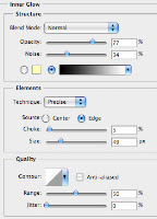
 The first step taken was the creation of the basic layout of my contents page. I created the box for the title running across the top of the page and added in an inner glow to give the black effect around the border of the box. I then used the rectangle tool to create the rest of the heading boxes for other sections of the contents page. I gave them a black fill and the bottom box a grey fill as it was to contain totally different information to the other sections.

I added the titles to each header and then added the title of the magazine contents but changed it slightly. Instead of putting in the title of the magazine a again, I slightly changed it to 'SubContents'. This had a red fill and a black stroke around it to help it stand out from the white background behind it.
All of the text relating to each of the sections was added in next. I made the titles of each section larger than the text underneath them. This helps it stand out and gives the reader a clear idea of what the section is about before.
One other feature I added at this point was the website address above the title to keep it from looking too plain and empty.
 I then added the main picture into my contents page. I aligned it and resized it so that it fitted in with the right hand column of the page. I added a black stroke around the picture to make it stand out slightly more from the white background. I then added in the text over the top of the picture.
 The next step I took to completing my contents page was to add in the album cover that I had previously created using photoshop. I cropped the image of my model into a square to represent the shape of real album covers. I then added a blue background into it with a white outer glow to the model. The final thing I did was to add in a clock in the corner of the screen and made it transparent and then added in text and an explicit content label. The cover was then resized to fit at the bottom of the page.
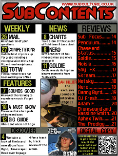
<< Here is the final piece of work.
No comments:
Post a Comment