Wednesday 29 February 2012

Evaluation Question 1

In what ways does your media product use, develop or challenge forms and conventions of real media products?


The current industry for the production and selling of music magazines is very competitive, and is becoming harder and harder for the success of music magazines to be prolonged for a great period of time. As of the beginning of 2011, these are the circulation figures for a selection of music magazines:


  • Mojo ( Bauer Consumer Media ) : 87,555 ; -7.5%
  • Q ( Bauer Consumer Media ) : 77,522 ; -12.1%
  • Classic Rock ( Future Publishing Ltd ) : 62,354 ; -7.9%
  • Kerrang! ( Bauer Consumer Media ) : 42,077 ; -2.1%
  • Metal Hammer ( Future Publishing Ltd ) : 35,259 ; -15.7%
  • New Musical Express ( IPC Media Ltd ) : 27,650 ; -14.0%
These figures clearly show that there is a lot of competition between the magazines. You can also see that not one of these magazines have managed to increase their circulation, most notably Metal Hammer magazine, whose circulation has dropped by 15.7%. The music magazine market is quite clearly fragmented and separated into magazines by the music genre they cover. I wanted to find a space in the market where I thought that my music magazine would be able to become dominant, whilst still basing it around a genre of music that I enjoy listening to. Through research I found that there is a relatively small number of music magazines that focus on the genres of dubstep and drum & bass, so this is what I decided to focus on.

The lack of other magazines within this genre of music meant that I had to find a way of relating the design and layout of my magazine to my target audience with no real identification of what it would expect. Therefore there are some features of my magazine that I have thought up myself and added to the design, and other features and ideas that use and develop the conventions presented in other types of music magazine.

Through further research (here and here) of the dubstep and drum & bass music genres I found out that the majority of my target audience would be males between the ages of 16-25, who regularly go to clubs and festivals, are heavy users of the internet, and are into the electro/dance/drum & bass/dubstep genres of music. This meant I knew what sort of headlines and artists I could feature in my magazine, and also gave me an idea of what colour schemes I could use in order to grab the audience's attention.

In popular music magazines, the way the titles are laid out are very different. Some magazines such as Q have their title as a logo in the corner of the page and some such as Vibe have the text written across the top of the page. Each of the titles follow a very clear structure, being positioned on the page in one of two ways, and I think that the title of my magazine follows the conventions of music magazines based on this. The title on my music magazine is laid out across the page, similar to Vibe, and this gives the impression that it is a serious magazine and will appeal to readers. If the title was placed somewhere that is different to the conventions of a music magazine, such as at the bottom of the page, the audience could see it as being something totally different and may not want to pick it up. The target audience would want to be picking up something that looks appealing to them. The positioning of the model on top of the title is another convention that I have continued on from real music magazines, and I think this makes the magazine look more professional.


Another feature surrounding my title that follows the conventions of music magazines is the strapline above the title. In some magazines you can find a strapline above or below the title. You can see that magazines focusing on a genre similar to mine (dance music) mostly all have straplines above or below the title, so to I decided to use the conventions by having this on my magazine. 


The contents pages of most music magazines seem to be laid out in similar ways, with stories listed under different categories such as 'news' and 'features'. Some magazines also feature a band index, which lists all of the bands featuring in the magazine. I tried to carry these features over into my magazine but ended up developing them. For example I have the headings down two columns of my music magazine instead of on, which seems to be the norm in the industry, and the picture taking up less of the space on the page, with information about more articles being dominant.  I felt that this shows my magazine is slightly more serious and focused on getting good articles consistently throughout the magazine, and less about just having one main article. 


I have however followed the convention of the main article being highlighted by a picture on the contents page with text on top of the picture. I feel that this makes the stand out more than the other features in the contents page and draws the readers attention to the main article.  The band index feature of music magazines is used in quite a few music magazines, but I decided to change this to 'Reviews' so that the readers will know what is being written about the bands, in this instance reviews of their music, and is better than having just the names of artists on the page with no indication of what has been written about them in the magazine. I think that I have developed the normal conventions of music magazines for the better in mine.


Another feature in my magazine that features often in music magazines is the option to scan a QR code to get a digital copy of  the magazine, or download a free gift. I felt it was appropriate to put in my magazine as it shows a use of the conventions seen in real music magazines, and also to act as a hook for my target audience who are technology based, as seen here. QR codes are being used increasingly frequently in modern music magazines and I feel that it is a key feature that needed to be included in my magazine to give it a feel of authenticity and make it look professional.


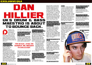
My double page spread also follows some conventions you would expect to find in music magazine, with the first example being the over-sized title featuring as a main part of the page. This is used to ensure readers are drawn staright to the title and can get an understanding of what the article is about without fully reading it. The colours used in the title are also coherent with the house style seen throughout my magazine, which is something that features heavily in real music magazines. You can see that the colours used are also similar to the title of a double page spread in mixmag magazine, which covers a similar genre of music to my magazine. This shows that the styling of my article is similar to those in real music magazines featuring on similar genres of music, meaning my double page spread will successfully reach my target audience.


Another feature of my double page spread that frequently appears in music magazines is the banner along the top of the page which includes a heading telling the reader what section of the magazine the article is from. I felt that this also gives my magazine an professional look and follow the conventions set by other magazines that have been professionally published.


Throughout my magazine I have pictures of two different models. One model features on the front cover, double page spread, and as the artist on the double page spread. I have created an album cover using the picture of my second model and have placed it in my contents page under the 'Discover' section. There is usually more than one picture throughout a front page, contents and double page spread of a magazine and I feel that using this convention of a music magazine will attract readers and make the magazine look professional. The inclusion of objects such as headphones and mixing decks in my pictures give a clear indication of the genre of music being focused on in the magazine.

The 'Discover' section is quite commonly seen in the contents pages of music magazines, but the inclusion of an album cover is not. I thought that putting this in will give the audience a better understanding of what they can expect to find in the magazine, and also grabs the readers attention as it is a visual that they will see instead of more text.


One final convention from real music magazines that I used in my magazine was the use of a consistent house style. I made sure that throughout the pages that I have created there was consistency with the colours and fonts used. This would hopefully make my magazine easier to read, and also continues with the presentation of the genre of the magazine.
Here you can see each page of my magazine next to the front page, contents and double page spread of NME magazine, to present how the house style has been used.


Wednesday 22 February 2012

Double Page Spread Article Final Draft

Dan Hillier – UK’s Drum & Bass maestro is about to bounce back.

Dan Hillier is one of the UK’s most promising new stars of the drum & bass scene. We haven’t heard much from him for just over six months now. We got the chance to catch up with him recently, and took the opportunity to find out what he’s been up to.

Q. So, Dan, you’re back! Where have you been these past six months?
A. Yeah, I know! It’s been a long time! I’ve really missed this ‘wonderful’ (sarcastic) weather back here in England. I’ve spent the last two years going anywhere and everywhere. Some nice areas, and some not so nice areas, it’s good to be back in familiar places. I mean everywhere aswell; you name a place, I’ve almost certainly been there! Australia, Mexico, USA, Ibiza, France, Italy, Romania and even Japan! The list is endless...

Q. Wow, that’s a lot of travelling. What have you been doing in all those places? Partying, having fun, living it large?
A. Haha I wish! The only partying I’ve done is on my own in a hotel room with my iPod. I’ve been out trying to make a name for myself in places where people wouldn’t have heard of me, playing in some of the world’s best clubs such as Amnesia and Studio 54, and getting some inspiration for my new stuff. It’s been work, work, work.

Q. Sounds awesome! Your fan base will have increased hugely after all that. New stuff? Might there be a new album in the works? The hype around this will be crazy if this is the case!
A. Hopefully so, all of the work should hopefully pay off. And yep, there sure is! My last album had quite a good reception here in the UK, but I was quite disappointed with how it was received around the rest of the world, so hopefully this one will be a lot better. People have now seen what I’m all about and I’ve hopefully picked up a few new fans on my travels. This time I’m back and I’m gonna be bigger than ever, nobody can stop me now!

Q. You said you gained some inspiration from your travels. Where would you say was the best place to play and who/where has inspired your new material most?
A. The best place I have performed has to have been Amnesia in Ibiza. The place was live! And for an artist, it has to be Goldie. He has to be one of the most recognisable faces in drum and bass, and I’ve been listening to his stuff for as long as I can remember. It’s almost an aspiration to be as good as the legend himself. Hopefully I can use some of the stuff I heard all around the world and mix it with the classic style of Goldie. This album could be my best yet!

Q. Cool, I’m looking forward to it. Now, lets find out a little bit more about you. First of all, what do your parents think about the music you make?
A. Ok, sure, I’m up for that! Ah my parents... I can’t really say that they love drum and bass to be quite honest. I think they’re more into that music you get at those family birthday parties. But they’ve always been supportive of whatever I do, even when it doesn’t really work. Yeah, they’re cool I guess.

Q. What was the first record you bought?
A. To be honest it was nothing special. My mum got me Now 57 or Now 58. I can’t really remember, it wasn’t too good though. Once I’d started earning my own money, I think the first album I got was ‘The Fat of The Land’ by The Prodigy. Now that is one great album!

Q. What’s with the name? Not very inventive is it?
A. That’s the point. I want people to know me, not a persona that everyone else comes up with. I find all that stuff a bit cheesy. It’s my music, my name.

Q. What was the first gig you went to?
A. It wasn’t really a gig but back in the 90s my mate took me to see this drum and bass event at some club in London. Don’t ask me where, I have no idea. I wasn’t too keen to go so just went along to keep him company really. This turned out to be the place where I found my love for drum and bass. If my mate hadn’t persuaded me to go I guess I wouldn’t be in the position I’m in right now. Guess I owe him!

Q. What music would we find on your iPod?
A. Wow, a whole variety of stuff. I’m into everything really. Bit of Oasis, Two Door Cinema Club, Kanye West, Gorillaz, Tinie Tempah. Oh and all the other stuff you’d expect me to have; Nero, Chase & Status, Netsky, Sub Focus, Pendulum etc. You might even find a bit of Frank Sinatra on there!

Q. wow! With all that great music you must have a tasty sound system at home, right?
A. Haha you would think so wouldn’t you! All I have is this shitty little dock from Tesco. It hardly even works!

Q. And what would you say is your favourite album of all time?
A. Of all time!? That’s a big question, but thinking about it it has to be Chase & Status – No More Idols. Pure Class!

Q. Finally, what would you say to someone reading this interview who hasn’t heard of you before?
A. Get on the internet, search my name, listen to my music, spread the word!

Q. Cool, thanks for your time!
A. No problem, and remember, spread the word!

Monday 20 February 2012

Double Page Spread Article Draft 1


Dan Hillier – UK’s Drum & Bass maestro is about to bounce back.

Q. So, Dan, you’re back! Where have you been these past two years?
A. Yeah, I know! It’s been a long time! I’ve really missed this ‘wonderful’ (sarcastic) weather back here in England. I’ve spent the last two years going anywhere and everywhere. Some nice areas, and some not so nice areas, it’s good to be back in familiar places. I mean everywhere aswell; you name a place, I’ve almost certainly been there! Australia, Mexico, USA, France, Italy, Romania and even Japan! The list is endless...

Q. Wow, that’s a lot of travelling. What have you been doing in all those places? Partying, having fun, living it large?
A. Haha I wish! The only partying I’ve done is on my own in a hotel room with my iPod. I’ve been out trying to make a name for myself, playing in some of the world’s best clubs, and getting some inspiration for my new stuff. It’s been work, work, work.

Q. New stuff? Might there be a new album in the works? The hype around this will be crazy if this is the case!
A. Yep, there sure is! I was quite disappointed with the reception my last album got so hopefully this one will be a lot better. This time I’m back and I’m gonna be bigger than ever, nobody can stop me now!

Q. Cool, I’m looking forward to it. Now, lets find out a little bit more about you and what sort of stuff you’re into. First of all, what do your parents think about the music you make?
A. Ok, cool, I’m up for that! Ah my parents... I can’t really say that they love drum and bass to be quite honest. I think they’re more into that music you get at those family birthday parties. But they’ve always been supportive of whatever I do, even when it doesn’t really work. Yeah, they’re cool I guess.

Q. Ok. First of all, what was the first record you bought?
A. To be honest it was nothing special. My mum got me Now 57 or Now 58. I can’t really remember, it wasn’t too good though. Once I’d started earning my own money, I think the first album I got was ‘The Fat of The Land’ by The Prodigy. Now that is one great album!

Q. What’s with the name? Not very inventive is it?
A. That’s the point. I want people to know me, not a persona that everyone else comes up with. I find all that stuff a bit cheesy. It’s my music, my name.

Q. Do you think you can be the one to give drum and bass a name and bring it into the mainstream?
A. I sure do! That was the point of the two years out, making a name for myself, It’s all part of the plan to revive drum and bass and bring it back into the spotlight where it belongs.

Q. What was the first gig you went to?
A. It wasn’t really a gig but back in the 90s my mate took me to see this drum and bass event at some club in London. Don’t ask me where, I have no idea. I wasn’t too keen to go so just went along to keep him company really. This turned out to be the place where I found my love for drum and bass. If my mate hadn’t persuaded me to go I guess I wouldn’t be in the position I’m in right now. Guess I owe him!

Q. What music would we find on your iPod?
A. Wow, a whole variety of stuff. I’m into everything really. Bit of Oasis, Two Door Cinema Club, Kanye West, Gorillaz, Tinie Tempah. Oh and all the other stuff you’d expect me to have; Nero, Chase & Status, Netsky, Sub Focus, Pendulum etc. You might even find a bit of Frank Sinatra on there!

Q. Wow! With all that great music you must have a tasty sound system at home, right?
A. Haha you would think so wouldn’t you! All I have is this shitty little dock from Tesco. It hardly even works!

Q. And what would you say is your favourite album of all time?
A. Of all time!? That’s a big question, but thinking about it it has to be Chase & Status – No More Idols. Pure Class!

Q. Finally, what would you say to someone reading this interview who hasn’t heard of you before?
A. Get on the internet, search my name, listen to my music, spread the word!

Q. Cool, thanks for your time!
A. No problem, and remember, spread the word!

Thursday 16 February 2012

Double Page Spread Flat Plan

Here is the original design that I came up with for the double page spread of my music magazine.

Tuesday 14 February 2012

Double Page Spread Research

There are many different features that are used in the double page spreads of music magazines. Some magazines have double page spreads where a picture takes up a whole page, some have many different pictures of mixed sizes all over the page, and some have a main picture in the middle of the page with a smaller one to the side. They are all different and there are many features that I could use from different magazines to help create my double page spread.

This is a double page spread from NME magazine. The picture covers all of the right hand page and a tiny portion of the left hand page in the centre. The white background of the image continues throughout the double page spread and this element is taken in the pull quote. The pull quote has a black block around it, which creates a contrast, making it stand out. The black border around the quote also keeps with a colour scheme of the double page spread as it matches the colour of Lily Allen's hair and parts of her shirt. The pull quote is also very different to the rest of the text on the page; it consists of each letter being of the same font, but different sized and aligned slightly off from each other. This grabs the readers attention and pulls them in to read the article.

There are also other features that are unique to the magazine including the how the name of the artist and the writer are in red, and the date of publication of the magazine and the NME logo are placed at the bottom of the page next to the page number. I think that something like this on the double page spread of my music magazine would work well as a design feature.

This is a double page spread from MixMag. You can see that the layout of this double page spread is different to that of NME. The picture only covers half of the double page spread, and is one one page. There is a lot more text on this double page spread, and it has a more formal look as the main title is all the same font and is the same size. The way that the pull quote is used on this double page spread is different to the one in NME. This one is very plain and simply laid out. It doesn't jump out at you. The simple dark text on the white background does however make it stand out, and a key feature on the page.

Another few features that this double page spread has is the banner along the top of the page with text telling you what section of the magazine it is, and what type of article it it, in this case it is a VIP Q+A. The title text is very bold and underlined. This ensures that it is the first thing the reader sees when they open the double page spread. The artists name is also highlighted which is a feature that is also present in the NME double page spread. One other thing that differs between the two double page spreads is that the MixMag DPS has another picture inserted to look like a polaroid which is also has text wrap around it. You can also see that at the beginning of both double page spread articles there is a drop cap. In the magazines they both use the font that is consistent with the house style of the magazine, but then move on to a normal font for the rest of the article.